Measuring RC Filter Cutoff Frequency
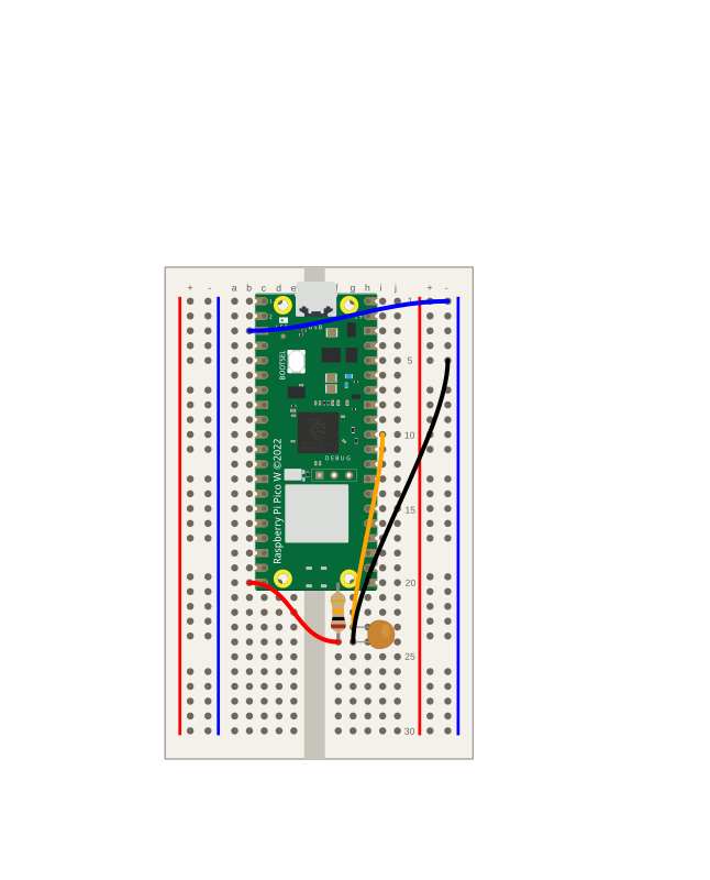
Take the RC low-pass filter and pin down its cutoff frequency, the speed where the output amplitude falls to about 70.7% of the input. Predict fc = 1/(2πRC) for a 10 kΩ and 0.1 µF filter (about 160 Hz), then drive it at different speeds and watch the output swing shrink to confirm the trend and the −3 dB idea.
Build an RC Low-Pass Filter
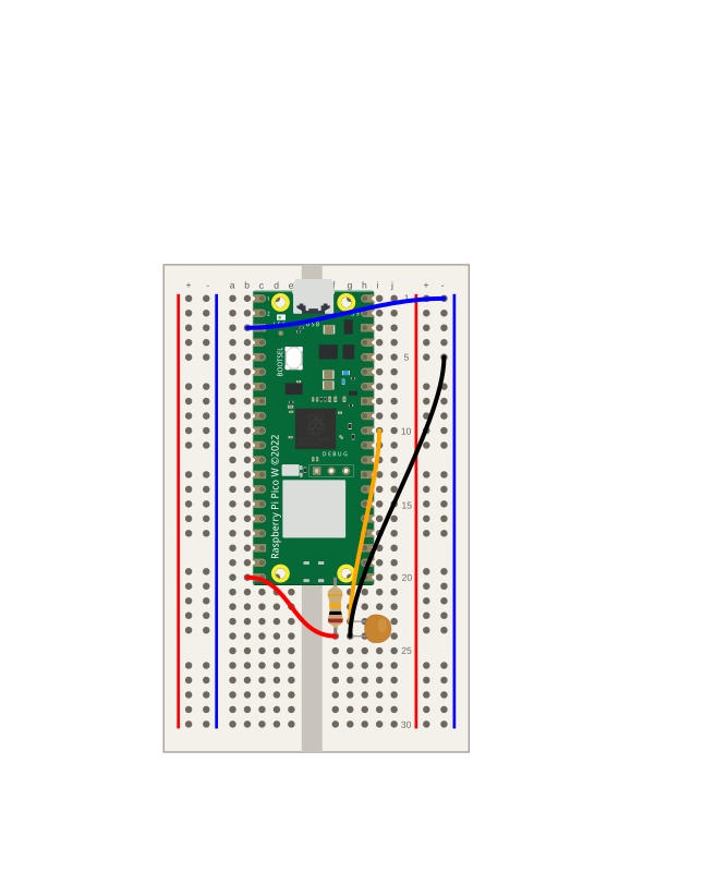
Turn an RC circuit into a low-pass filter on the Pico W: drive it with a square wave from a GPIO, read the output with the ADC, and plot the commanded input beside the measured output. See intuitively why slow changes pass through while fast ones get smoothed away.
How Resistance and Capacitance Affect Charging Time
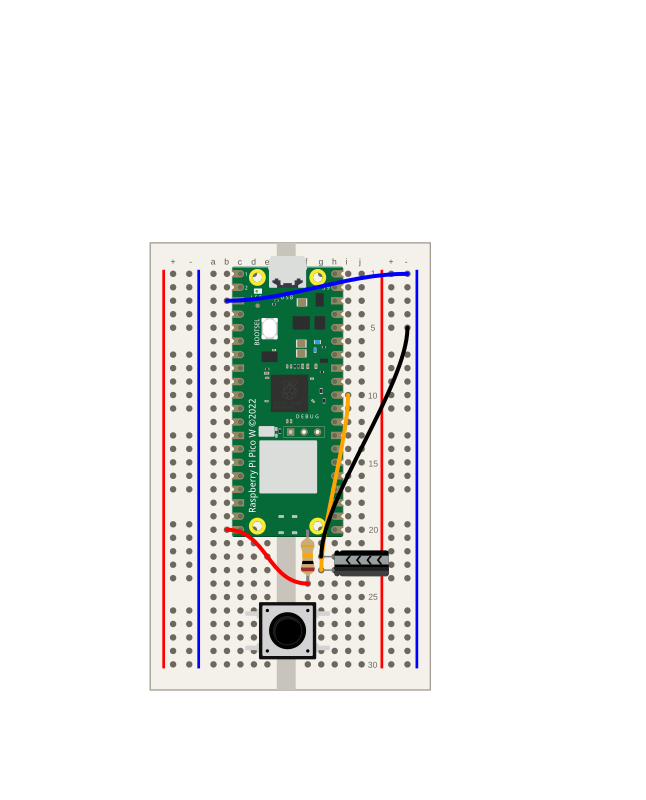
Keep the Pico W RC circuit and swap in different resistors and capacitors to see how each changes the charging time. Predict faster or slower with τ = R × C, measure the crossing at 2.09 V, and build a table confirming that more R or more C means a longer charge.
Measuring the RC Time Constant
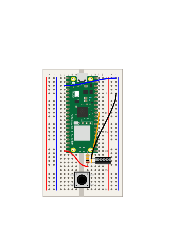
Reuse the Pico W resistor–capacitor circuit to measure the time constant τ = RC: find when the capacitor reaches ~63.2% of the supply, then compare your measured τ against the calculated one.
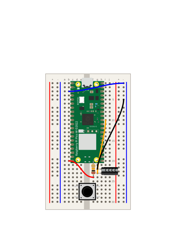
Measuring Capacitor Charge and Discharge
Build a resistor–capacitor circuit on the Pico W, measure the capacitor's voltage with the ADC, and plot the charging and discharging curves over time.
pr-40
test

Using the Plotter
How to use the Plotter to view data in a line graph as it is printed from a device
Blinking the builtin LED using Micropython
how to make the built in led blink
Using the Plotter
What is the Plotter?
The Plotter is a tool that allows you to view the data from your device plotted on a line graph. This is useful when you have some sensors that gather time series data, and you want to view the trends in the data. For example, let's say you have a sensor monitoring the voltage of a signal that fluctuates over time. You would create a script that reads the value of the sensor on a regular interval, and logs out the value using a print() statement. It's possible to view multiple signals in the Plotter; simply separate each value with a comma, and use a newline to separate each set of values in the time series.
How to use the Plotter
- In your Python code, call
print()with a string containing your data values separate by commas. For example:print(f"{value1:.3f},{value2:.3f},{value3:.3f}") - If there is a line of data where a value is missing, simply omit that value, such as:
print(f"{value1:.3f},,{value3:.3f}"). This will plotvalueandvalue3, but skipvalue2(which will appear as a gap in the line). - Run the file.
- Open the Plotter dialog:

- Click the Start Plotting button:

- You can now view a line graph of your data that updates in real time.

Example Scripts
Without millisecond offset from zero as first value
In most cases, you will not need to include any timing information in your print() statements; you can just log the data itself. The timing of each data point is slightly less precise with this method.
Python
import math
import time

# This is a simple example that shows how to print out
# values so they can be graphed with the Plotter.
# A real program would most likely read values from a
# sensor, rather than generating them with math.

# === Configuration ===
UPDATE_RATE_HZ = 50
FREQ_SINE = 0.5

interval = 1 / UPDATE_RATE_HZ
two_pi = 2 * math.pi

start_time = time.ticks_ms()

while True:
    t_ms = time.ticks_diff(time.ticks_ms(), start_time)
    t = t_ms / 1000.0

    sine = math.sin(two_pi * FREQ_SINE * t)

    # === Print values so the Plotter can draw them ===
    print(f"{sine:.3f}")

    time.sleep(interval)
With millisecond offset from zero as first value
When you need more precise timing, include the millisecond offset from zero as the first value and toggle the switch as shown below.

This example scripts shows how to include the millisecond offset as the first value in your print() statement.
Python
import math
import time

# This is a simple example that shows how to print out
# values so they can be graphed with the Plotter.
# A real program would most likely read values from a
# sensor, rather than generating them with math.

# === Configuration ===
UPDATE_RATE_HZ = 50
FREQ_SINE = 0.5

interval = 1 / UPDATE_RATE_HZ
two_pi = 2 * math.pi

start_time = time.ticks_ms()

while True:
    t_ms = time.ticks_diff(time.ticks_ms(), start_time)
    t = t_ms / 1000.0

    # === Generate each signal with its own frequency ===
    sine = math.sin(two_pi * FREQ_SINE * t)

    # === Print to serial ===
    # This time, the first value is the millisecond offset
    # from zero, so we need to toggle the switch accordingly
    # in the Plotter.
    print(f"{t_ms},{sine:.3f}")

    time.sleep(interval)